Traversal Brand refresh

2026

Services

Brandsystem
Digital
Visual design & motion
Social & Editorial
Campaign

Industry

AI

Client

Traversal

Information

Traversal is a developer tooling startup building AI-native infrastructure for production engineering, helping engineering teams detect, diagnose, and fix incidents without the context-switching. They came to us to build a visual identity that could hold up across product, marketing, and merch: something that felt technical without being cold, and ambitious without being loud.

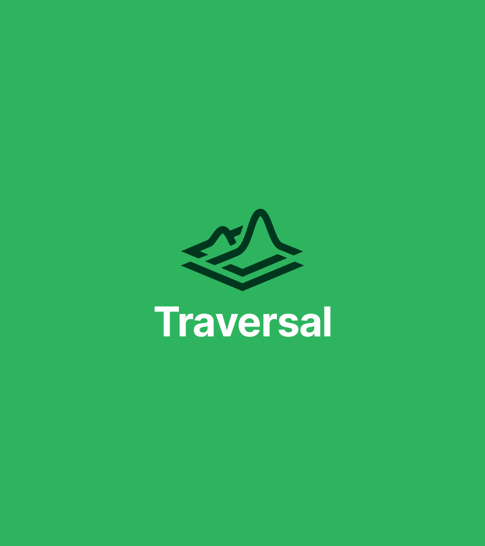
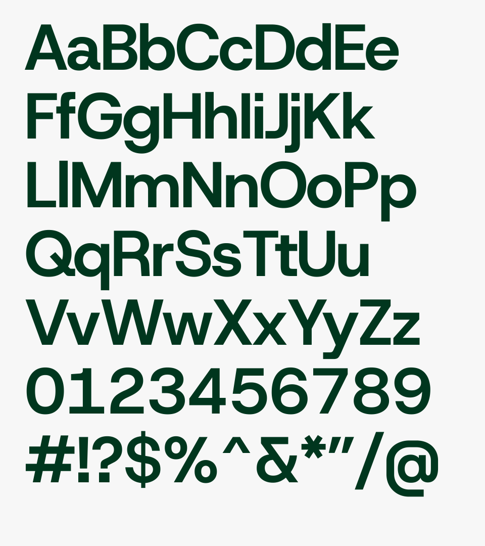
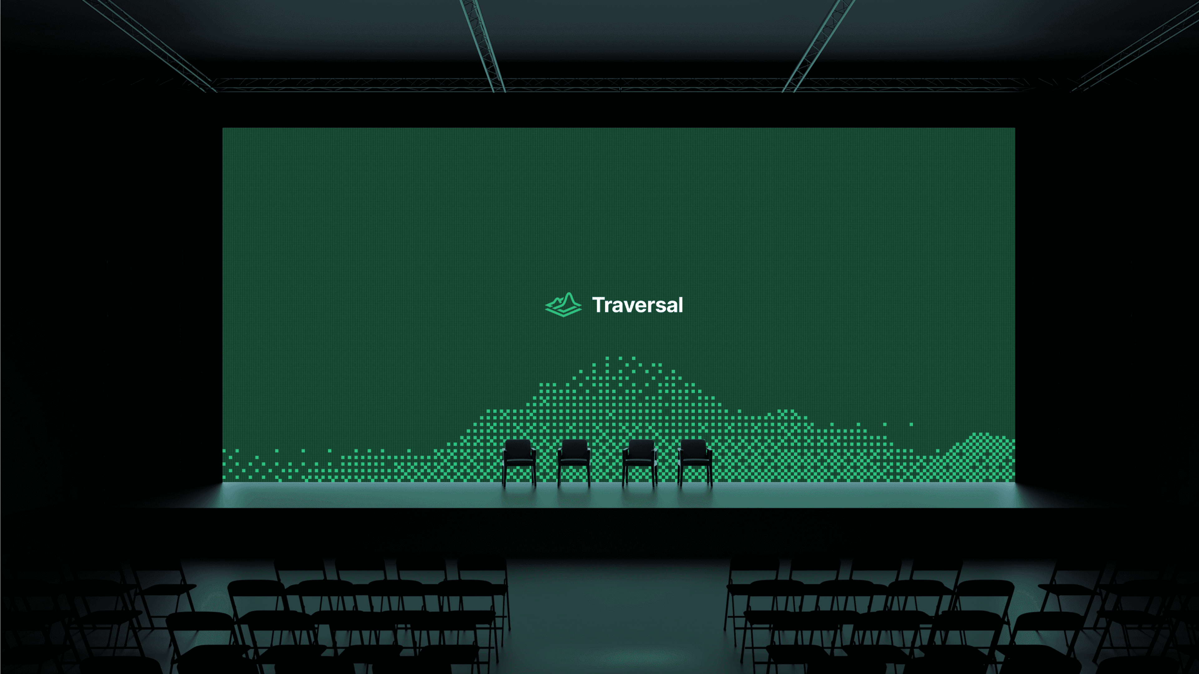
We refined the existing logo and extended it into a full system. A mark that doubles as terrain and signal, a typeface that means business, and a visual language that travels: from digital product to campaign assets, conference booths to a wrapped car.

Traversal Brand refresh

2026

Services

Brandsystem
Digital
Visual design & motion
Social & Editorial
Campaign

Industry

AI

Client

Traversal

Information

Traversal is a developer tooling startup building AI-native infrastructure for production engineering, helping engineering teams detect, diagnose, and fix incidents without the context-switching. They came to us to build a visual identity that could hold up across product, marketing, and merch: something that felt technical without being cold, and ambitious without being loud.

We refined the existing logo and extended it into a full system. A mark that doubles as terrain and signal, a typeface that means business, and a visual language that travels: from digital product to campaign assets, conference booths to a wrapped car.
Traversal Brand refresh

2026

Services

Brandsystem
Digital
Visual design & motion
Social & Editorial
Campaign

Industry

AI

Client

Traversal

Information

Traversal is a developer tooling startup building AI-native infrastructure for production engineering, helping engineering teams detect, diagnose, and fix incidents without the context-switching. They came to us to build a visual identity that could hold up across product, marketing, and merch: something that felt technical without being cold, and ambitious without being loud.

We refined the existing logo and extended it into a full system. A mark that doubles as terrain and signal, a typeface that means business, and a visual language that travels: from digital product to campaign assets, conference booths to a wrapped car.

Peaks that double as waveforms. One shape,
two readings.

Weight without ego. A typeface that gets out of the way and lets the message land.

Green was never a question. It's the color of systems running.

Hovering between representation and abstraction. Close up it's noise. Step back and something emerges.

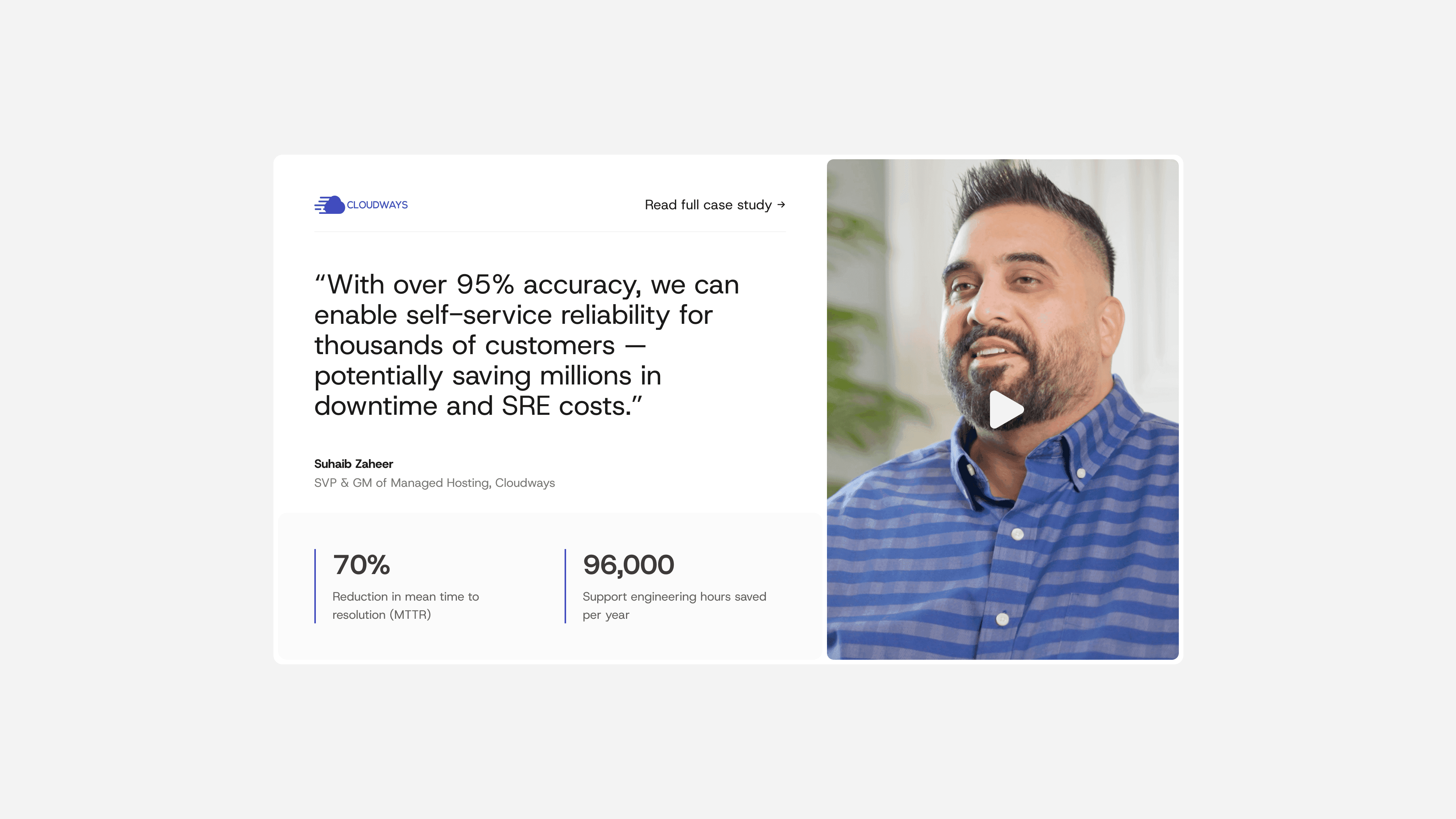
Take what Traversal does, strip the jargon, and make it land before the visitor has to think

Instantly recognizable in a crowded feed. A brand that looks like the product it's selling: precise, technical, engineered.

A campaign that knows who's reading it. Lines sharp enough for engineers, serious enough for the people who sign the contracts.

A brand built online, just as sharp offline. Booths, banners, signage — the system holds up at any scale, in any room."